
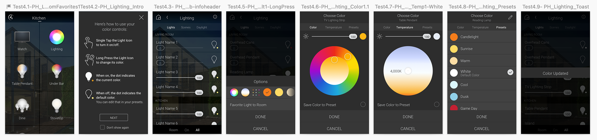
New Feature: Adding Color Controls to Smart Home Lighting Ecosystem
Adding color control to Control4's legacy smart home lighting experience adds customer control to edit their color and temperature bulbs, as well as supporting many advanced features. Multiple rounds of user testing led to a change in the core interaction, icon updates to increase comprehension, and resulted in a more discoverable, intuitive experience for customers.

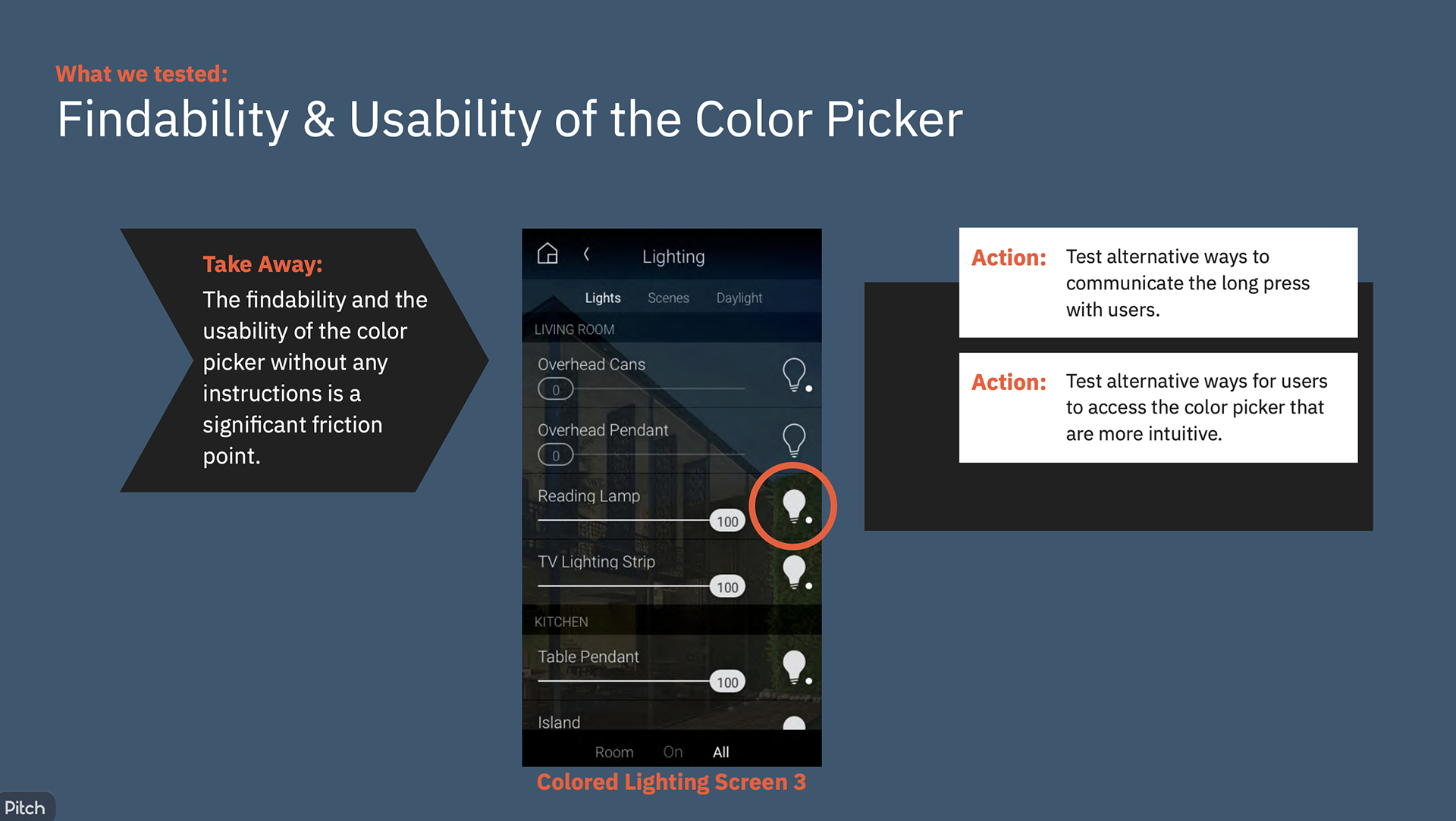
Where we began: User Testing validated beta user feedback that Color Controls were not discoverable enough.
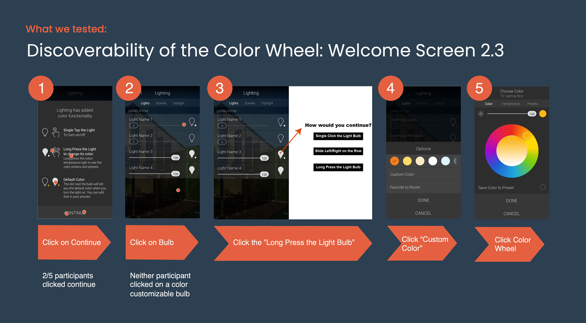
Test 1 - Add an Onboarding Screen to introduce the gesture of the long-press to access color controls.
Test 1 - Add an Onboarding Screen to introduce the gesture of the long-press to access color controls.
Building on the ecosystem of our legacy OS and UI design patterns:
• Bulb Single Tap - Powers a bulb on/off, • Bulb Long-Press - Open color controls
• Bulb Single Tap - Powers a bulb on/off, • Bulb Long-Press - Open color controls
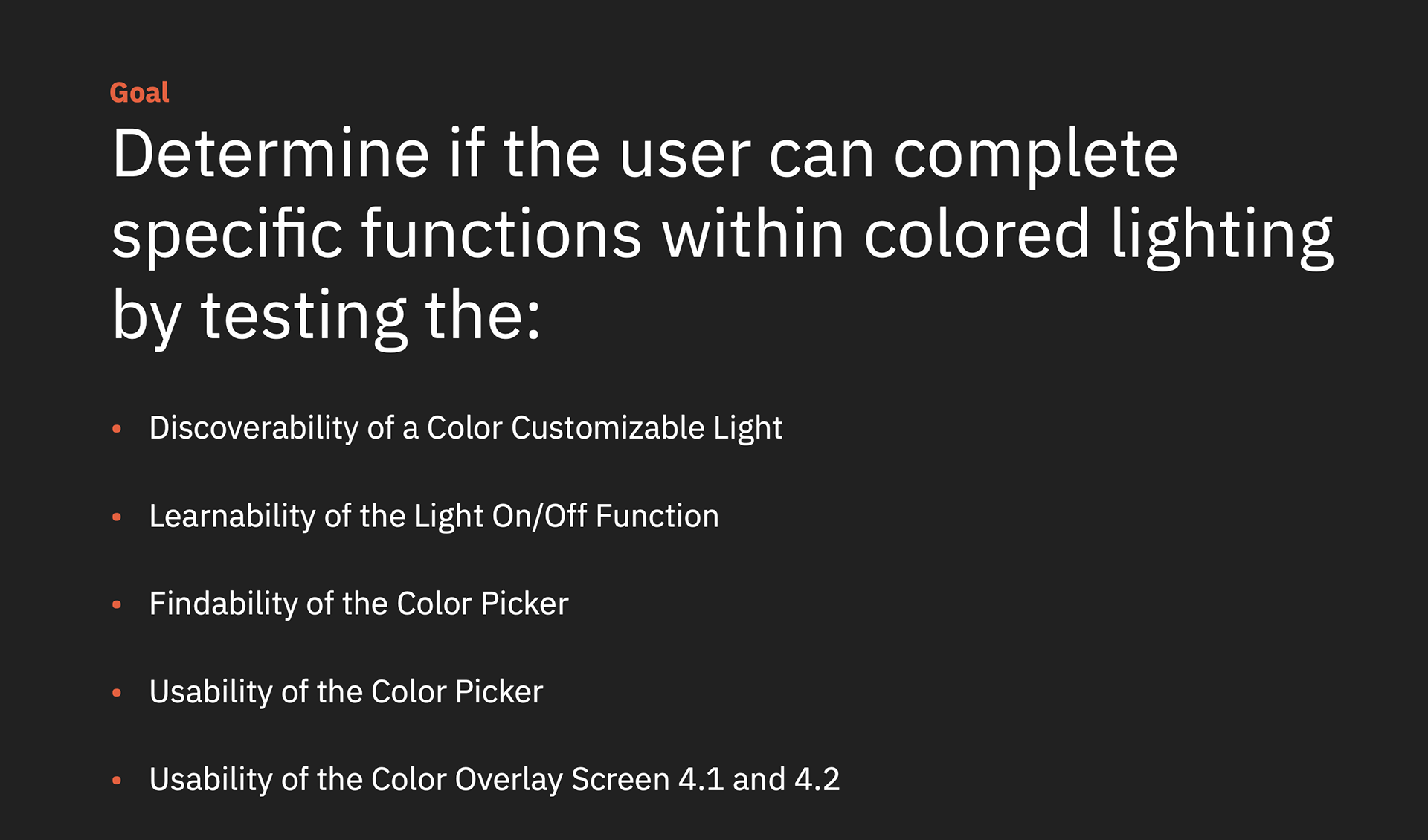
User Testing for Task-Completion and Comprehension:
Can a customer change their light bulb color successfully with added onboarding screen
that teaches about the long-press gesture?
Can a customer change their light bulb color successfully with added onboarding screen
that teaches about the long-press gesture?
Problem:
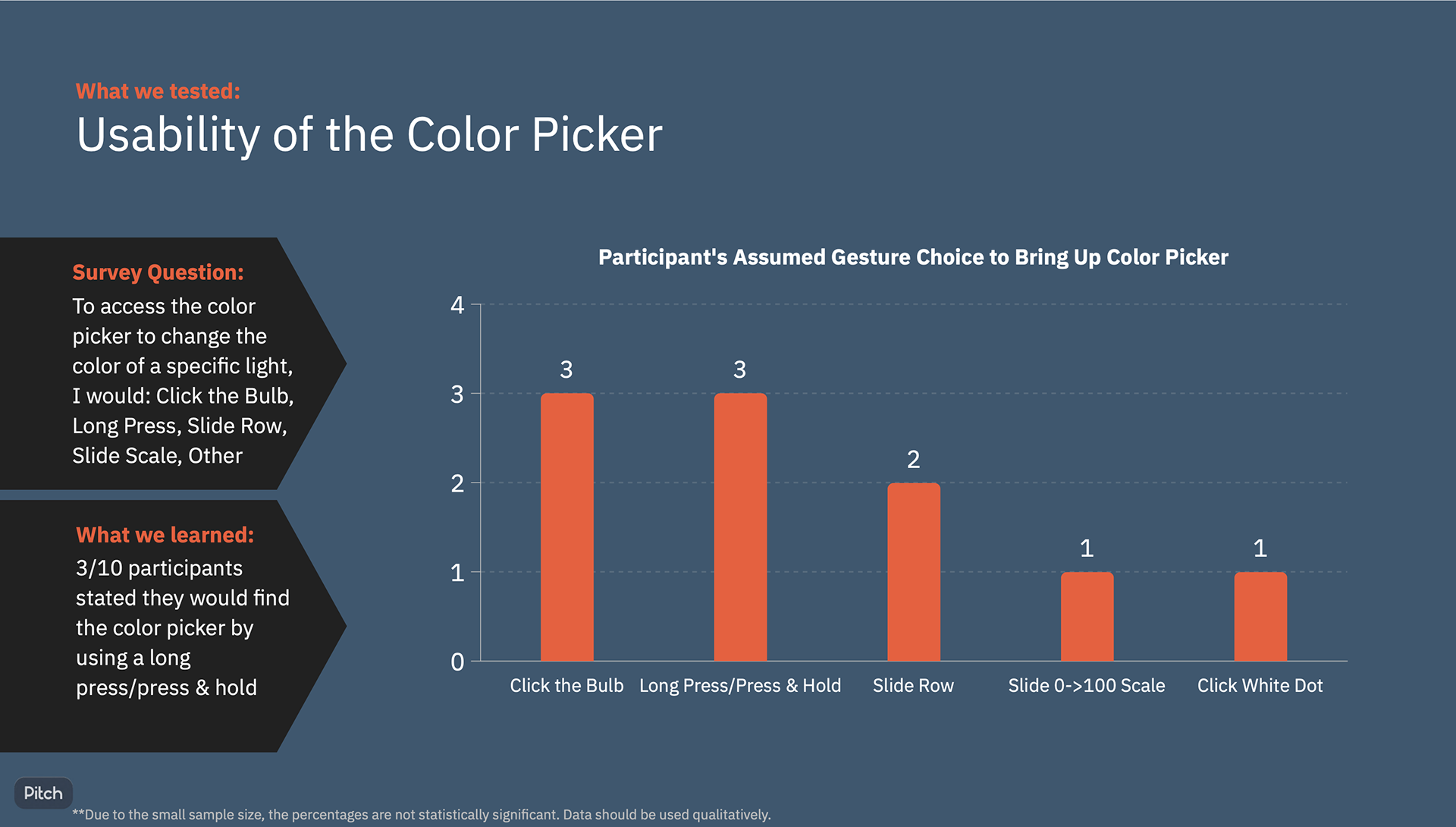
Customizing a bulb's color controls is behind the long-press gesture (a design pattern in the legacy UI for advanced features and editing). We know from looking at the data throughout our UI, that the long press is not well-used or discovered. Installers don't teach the gesture, therefore it is tribal knowledge and not widely used. User testing data validated this friction, and designs are further iterated and tested to increase discoverability.
Customizing a bulb's color controls is behind the long-press gesture (a design pattern in the legacy UI for advanced features and editing). We know from looking at the data throughout our UI, that the long press is not well-used or discovered. Installers don't teach the gesture, therefore it is tribal knowledge and not widely used. User testing data validated this friction, and designs are further iterated and tested to increase discoverability.
Test for the Question:
If we teach a customer about the long-press gesture, will they successfully complete the task of changing their color bulb?
If we teach a customer about the long-press gesture, will they successfully complete the task of changing their color bulb?
Test Results:
Even with the added customer onboarding screen, task completion is not successful enough.
Even with the added customer onboarding screen, task completion is not successful enough.
Next Steps:
Keep iterating and testing.
Keep iterating and testing.
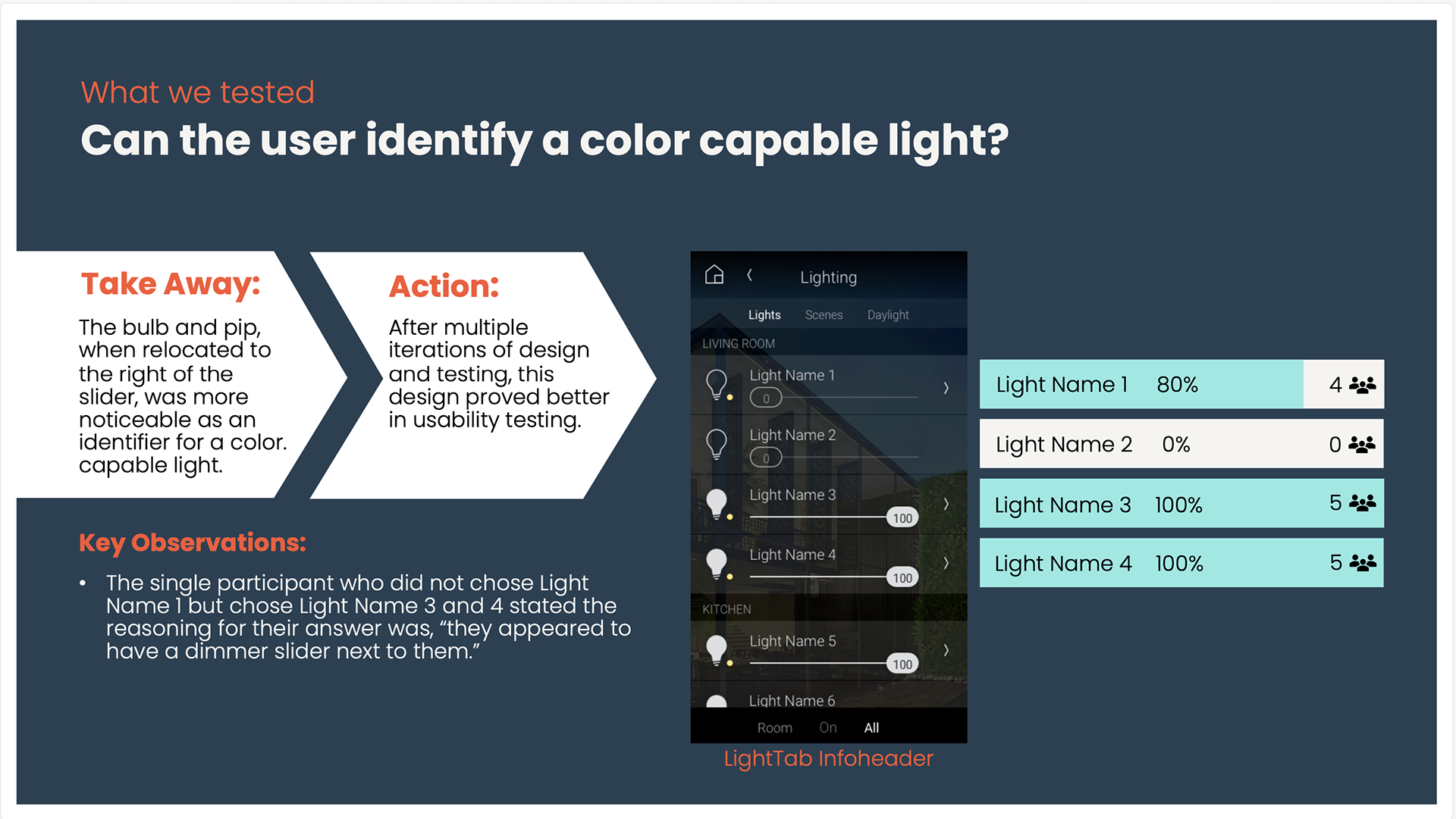
Sample pages from one of the reports from User Testing
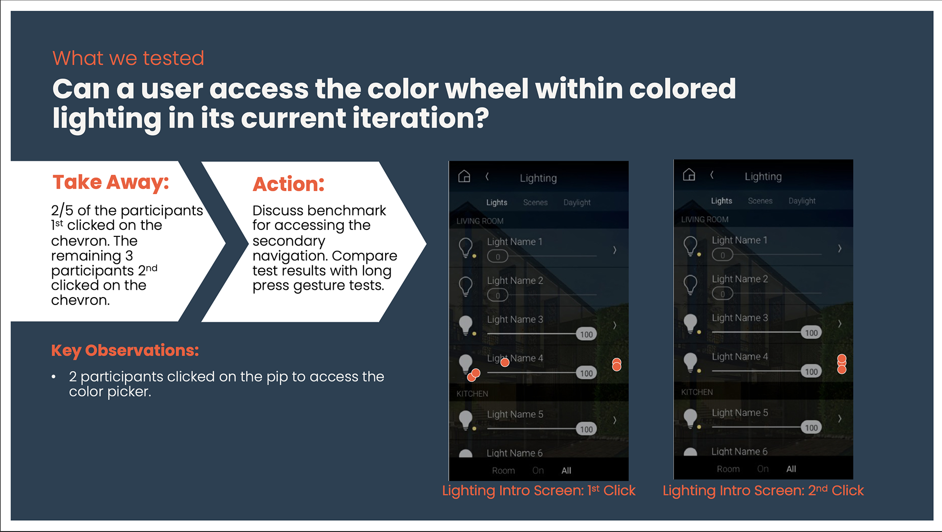
User Testing 2 - Introducing a New Design Pattern to the UI
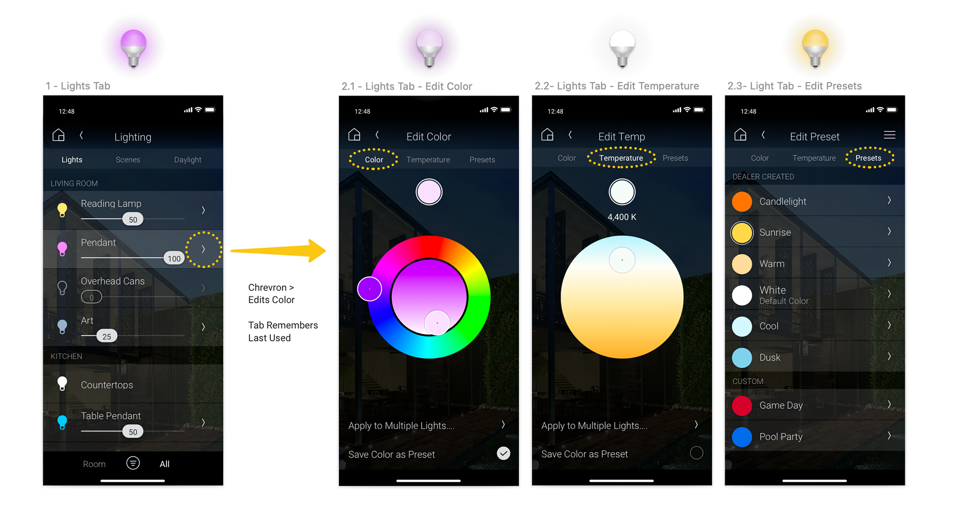
Due to poor test results in prior tests, we abandon the long-press gesture, and change the design pattern to access color controls from the Chevron > with greater discoverability and task success rate.
Due to poor test results in prior tests, we abandon the long-press gesture, and change the design pattern to access color controls from the Chevron > with greater discoverability and task success rate.
Problem:
Due to poor test results in prior tests adding onboarding communication, then testing wording vs. images of gestures, further iteration was needed.
Test another design pattern for a more successful discovery and task completion rate.
Due to poor test results in prior tests adding onboarding communication, then testing wording vs. images of gestures, further iteration was needed.
Test another design pattern for a more successful discovery and task completion rate.
Objective 2:
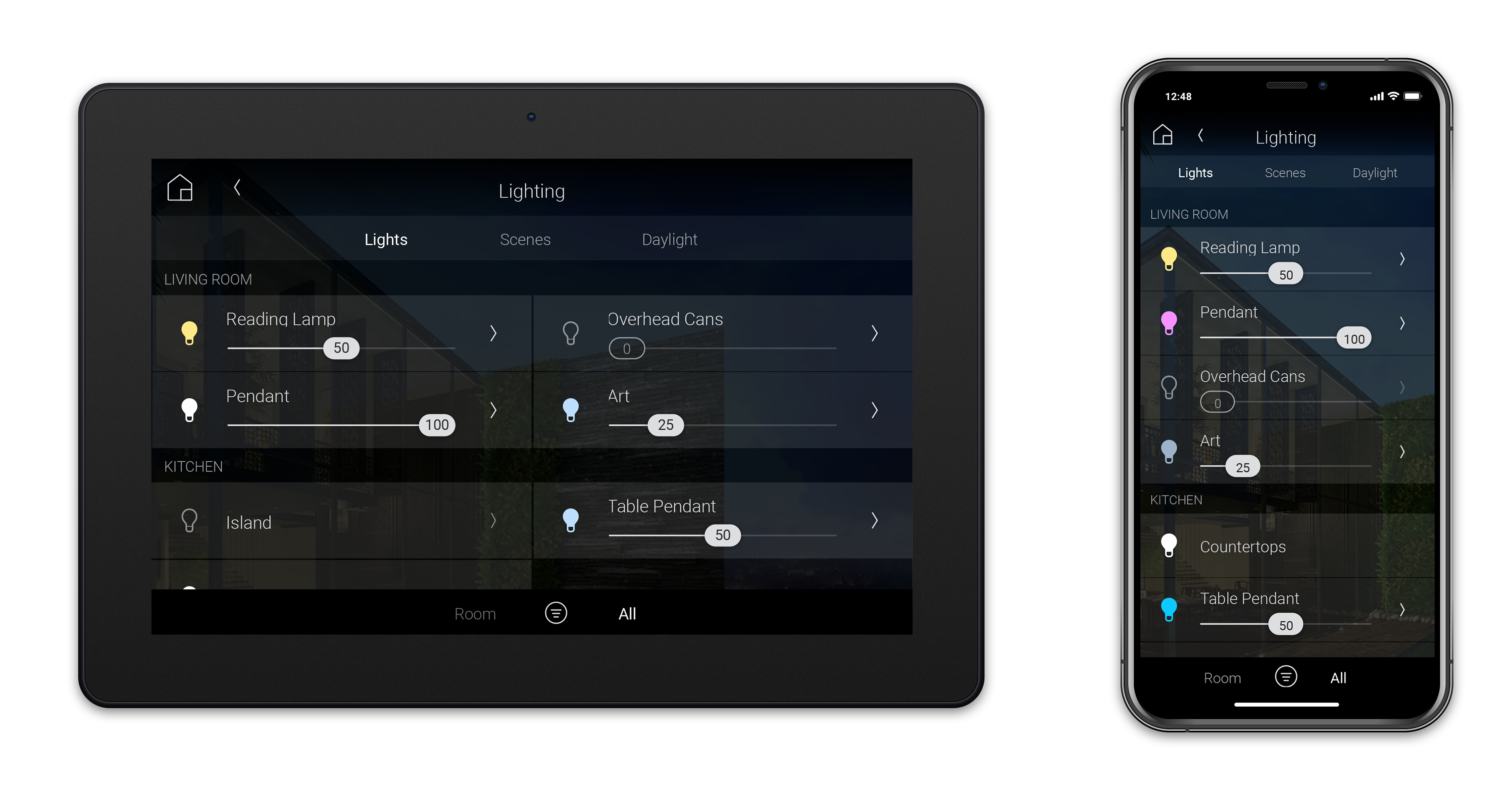
Redesign the row component for a Light, and add a chevron to edit and access the color controls. No onboarding added.
Redesign the row component for a Light, and add a chevron to edit and access the color controls. No onboarding added.
Test for the Question:
Adding a Chevron > to the end of a row, will a new user successfully complete the task of changing their color bulb?
Adding a Chevron > to the end of a row, will a new user successfully complete the task of changing their color bulb?
Test Results:
• With minimal discovery (testing the bulb icon and the Chevron), within 2 clicks, there was a 100% successful discovery of accessing lighting controls.
• Very encouraging update.
• With minimal discovery (testing the bulb icon and the Chevron), within 2 clicks, there was a 100% successful discovery of accessing lighting controls.
• Very encouraging update.
Next Steps:
• Development spike to size an updated component.
• Edits through the UI need to be defined.
• Holistic updates are made to the UI to treat the Chevron (>) as a discoverable way to edit.
• Development spike to size an updated component.
• Edits through the UI need to be defined.
• Holistic updates are made to the UI to treat the Chevron (>) as a discoverable way to edit.
Key Results and a Positive Path Forward:
User testing took 5 weeks and $150 for unmoderated user tests with the general population.
User testing and design iterations led to a better user experience for our end customers with better discoverability and usability, updated before the end of beta testing and release to our professional channel.
Additional opportunities:
• Icon updates - colorized bulbs to show the color state
• UI row component update to use the Chevron for primary edits.
• Icon updates - colorized bulbs to show the color state
• UI row component update to use the Chevron for primary edits.
Next Steps:
After release, we expect engagement with color controls and continue to learn from customers.
Data will be reviewed in cadence to measure user engagement, to understand their real-world preference for how they use their color controls both in product discovery, and in using the product over time. Understanding how customers choose to customize their lighting UI in Phone, and Tablet interfaces will inform future iteration.
Data will be reviewed in cadence to measure user engagement, to understand their real-world preference for how they use their color controls both in product discovery, and in using the product over time. Understanding how customers choose to customize their lighting UI in Phone, and Tablet interfaces will inform future iteration.