What - The company and Product:
DPS is a boutique ski company with award winning Carbon Fiber high performance skis. At the time of this eCommerce UX review, their web presence had nice design, but was lacking some key elements necessary to increase user confidence in B-C eCommerce sales
My Role:
• UX review and identify proposed easy fixes to reduce friction in a customer's online path to purchase.
• Demonstrate design enhancements with a side by side visual approach.
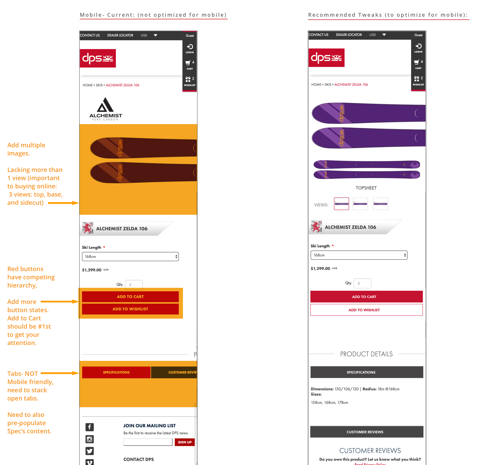
• Optimize for mobile.
recommended strategy:
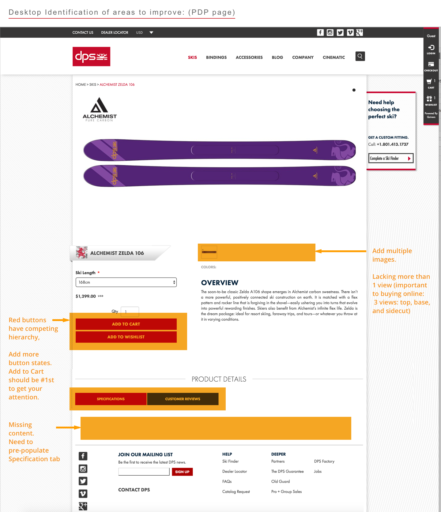
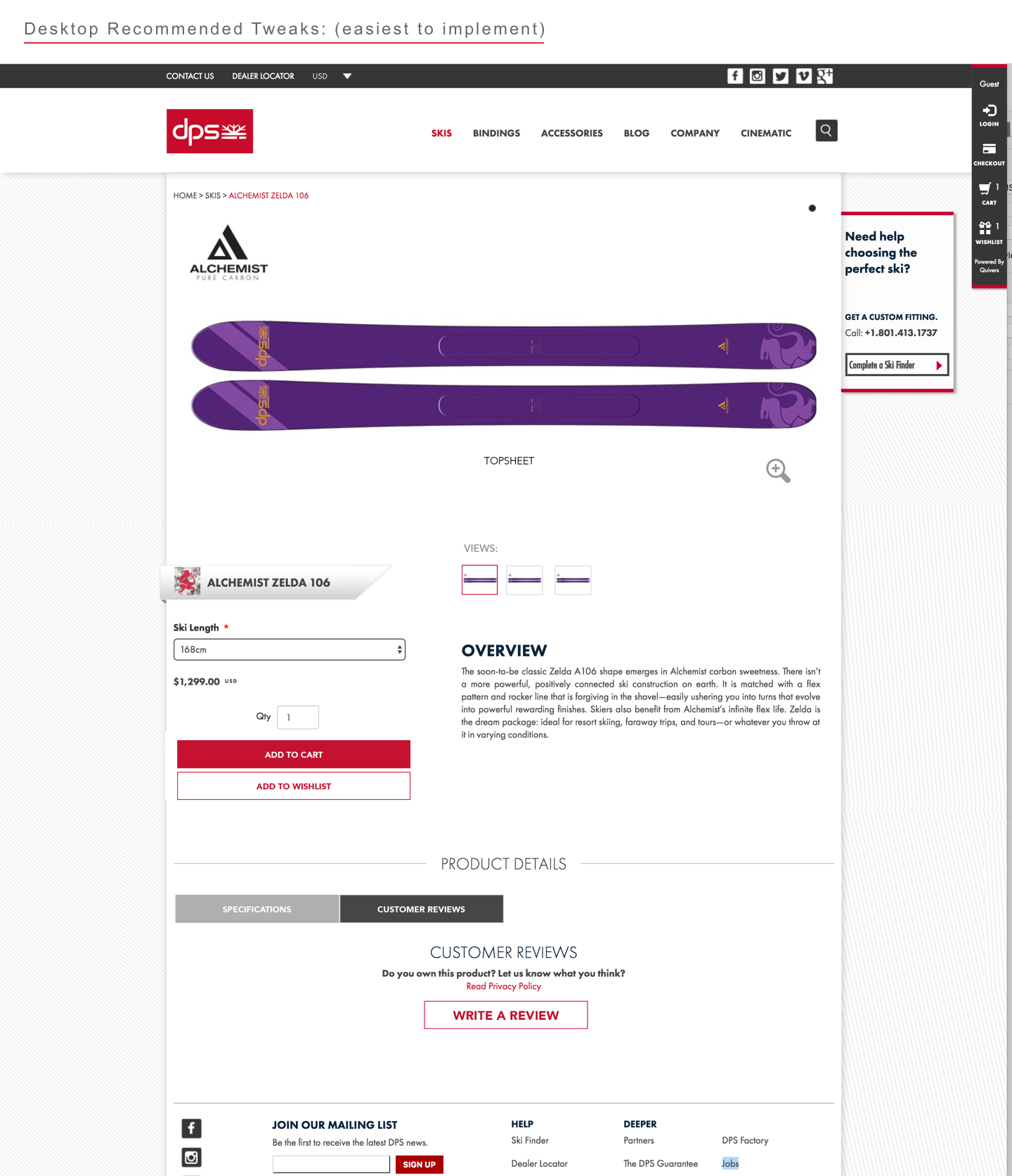
Increase online buyers confidence buying online by showing more product details:
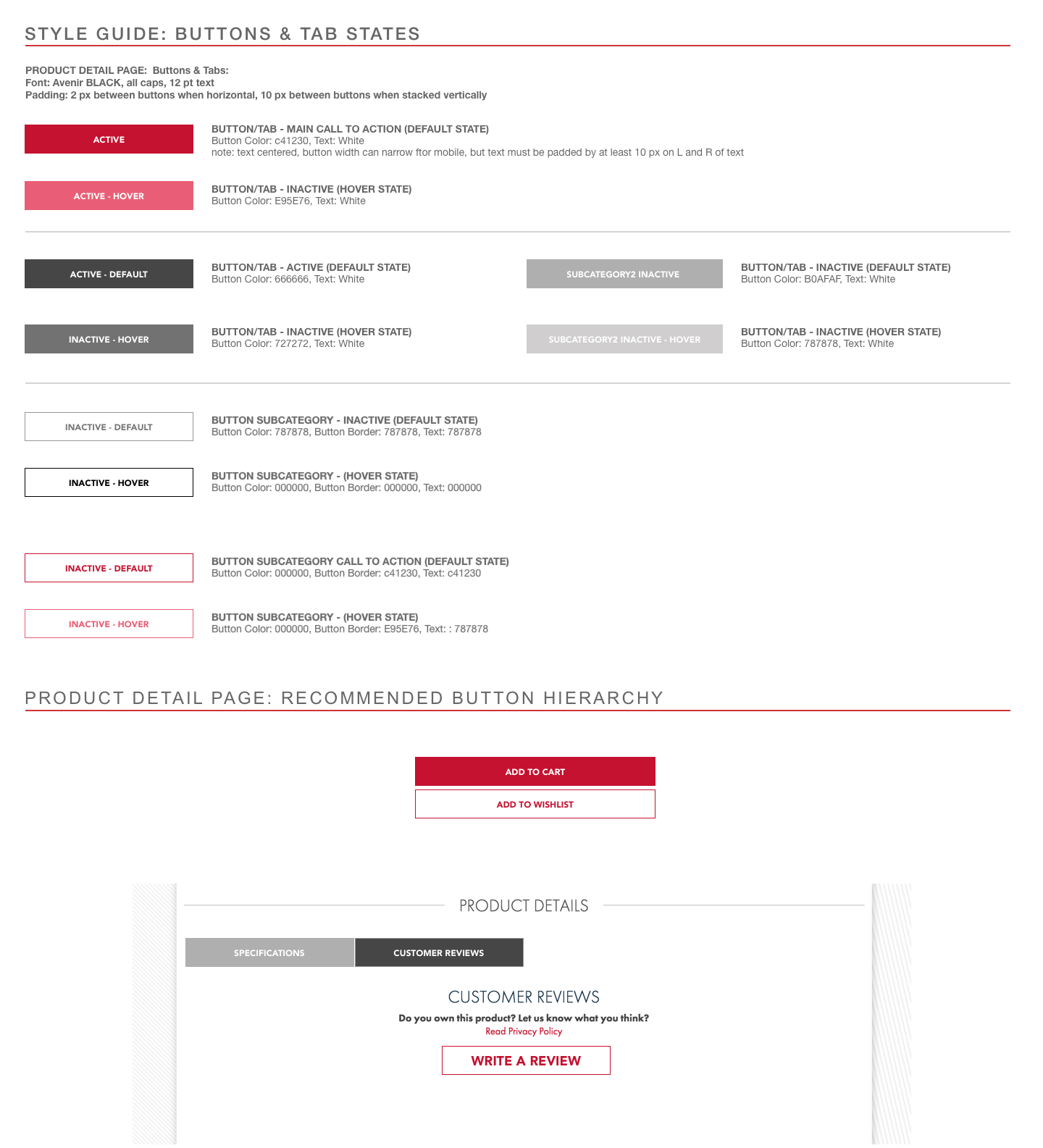
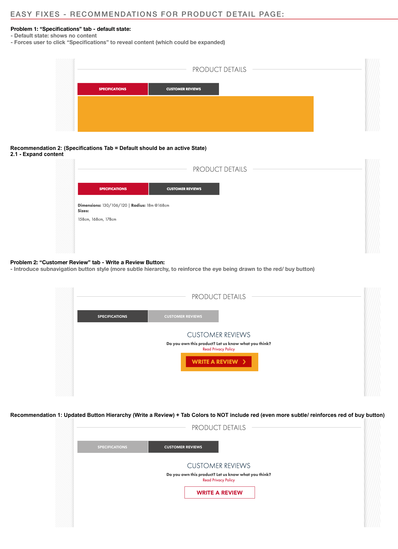
• Add eCommerce hierarchy by adding button states for main, and secondary calls to action.
to bring more focus to the Red Buy Button
• Add eCommerce hierarchy by adding button states for main, and secondary calls to action.
to bring more focus to the Red Buy Button
• Optimize for Mobile - Specifications need to be visible in first view
• Fill out missing content: Add missing online specifications, views, and customer reviews.
• Add more image views - show all views (top, side, bottom)
Takeaways:
Though this was a thought exercise, a UX review:
• eCommerce patterns influence expectations, and small changes can reduce friction buying online.
• Sometimes a side by side of what can be inspires change.
• B-C is more profitable, and these kinds of improvements are also good for brand-building, customer product research, and buyer's confidence.
• eCommerce patterns influence expectations, and small changes can reduce friction buying online.
• Sometimes a side by side of what can be inspires change.
• B-C is more profitable, and these kinds of improvements are also good for brand-building, customer product research, and buyer's confidence.
the pitch - the process:
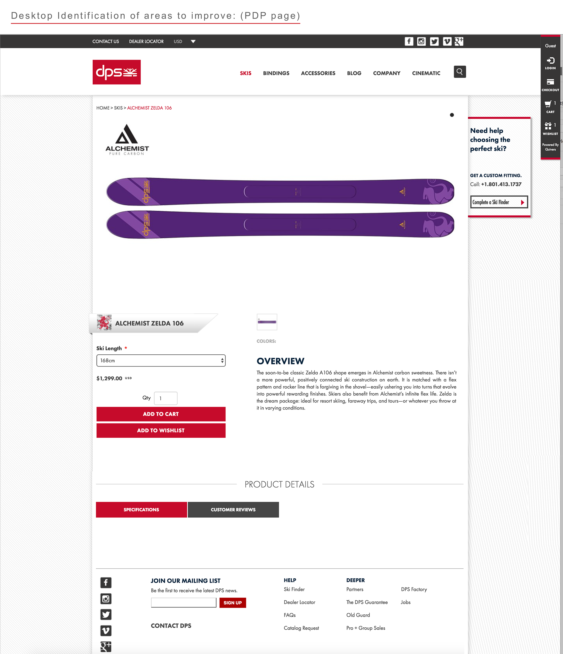
Product Detail Page - starting point
Product Detail Page (highlighting areas that can be improved):
Product Detail Page - showing recommended UX improvements:
Mobile Product Detail Page:
DPS Style Guide Update (Recommended):