
the project and company:
• Within the smart home automation ecosystem, add new lighting features that create the best experience for customers using the product in their homes.
• Add color control features to the established lighting ecosystem to support color and temperature bulbs.
• Make it intuitive and easy to discover and learn by doing
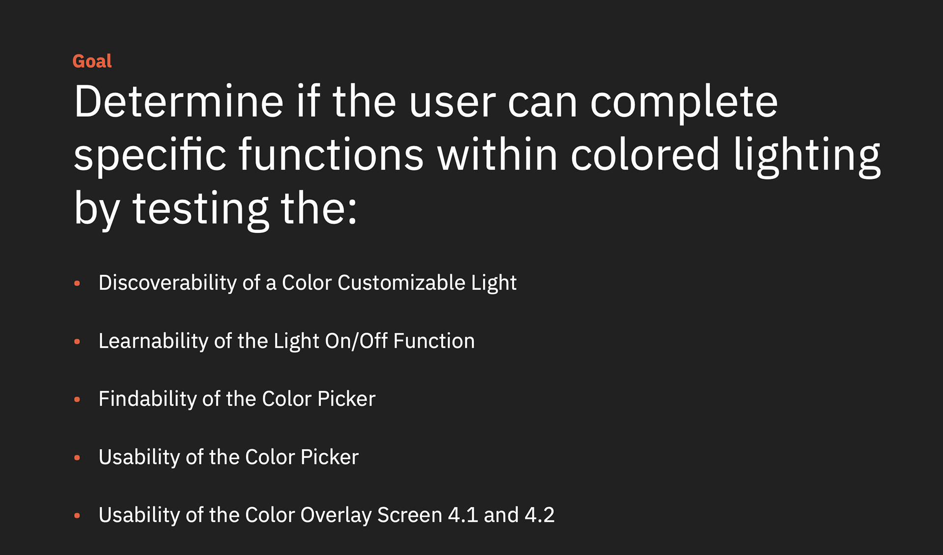
• Designing for Mobile-first. Test designs for task completion (with the general population)
Why this matters:
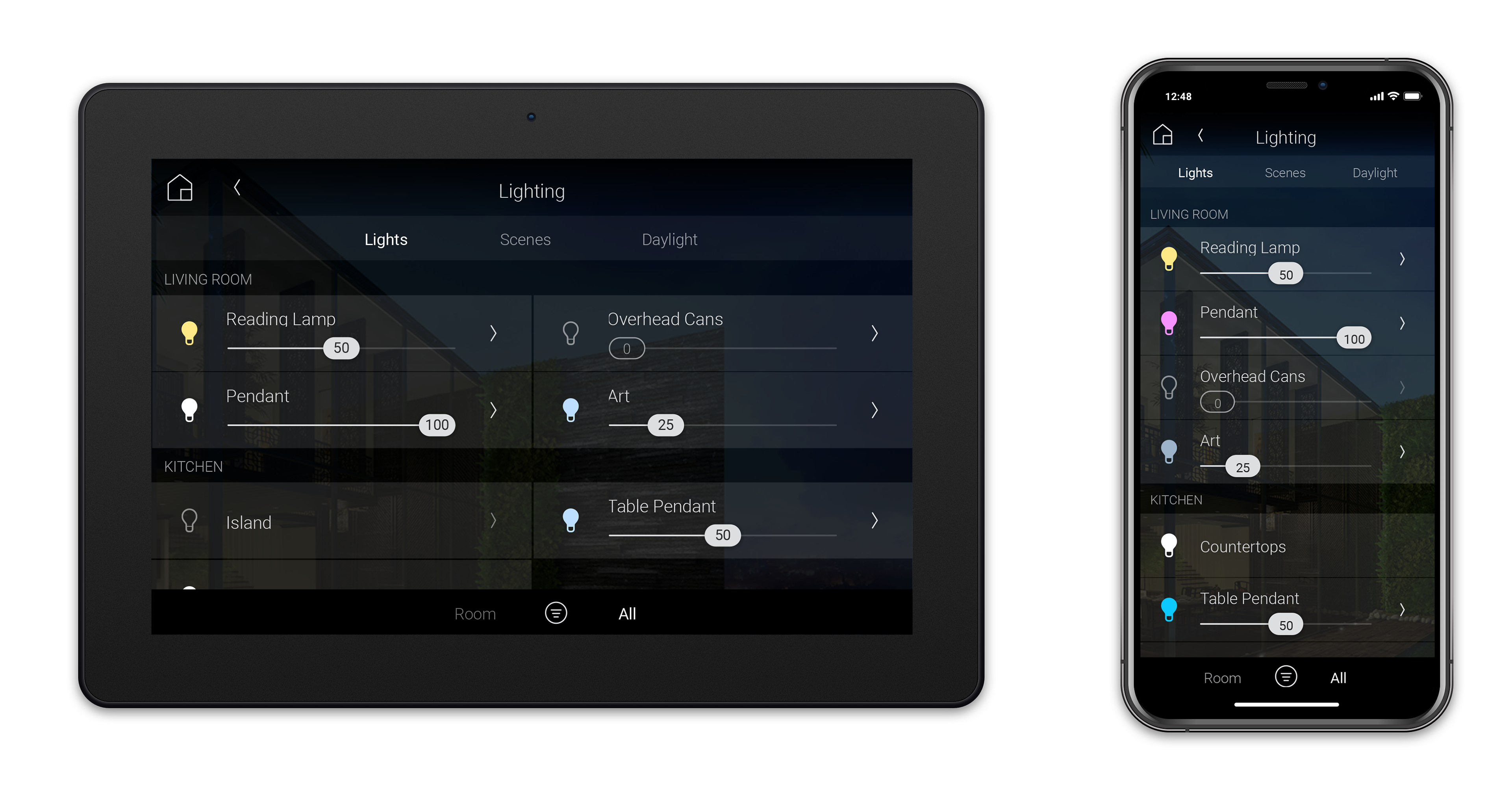
The existing lighting ecosystem was not built to support color and temperature lighting, an expectation of modern home automation.
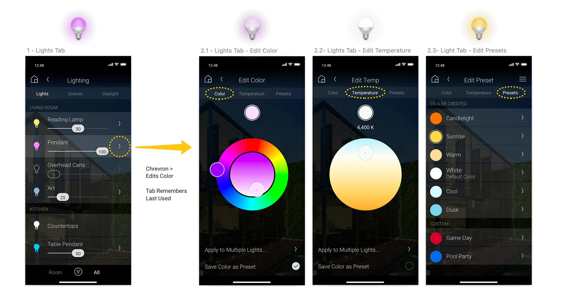
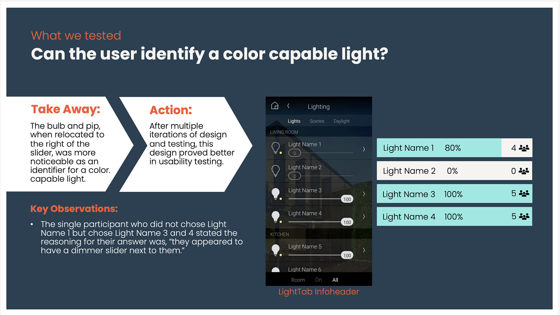
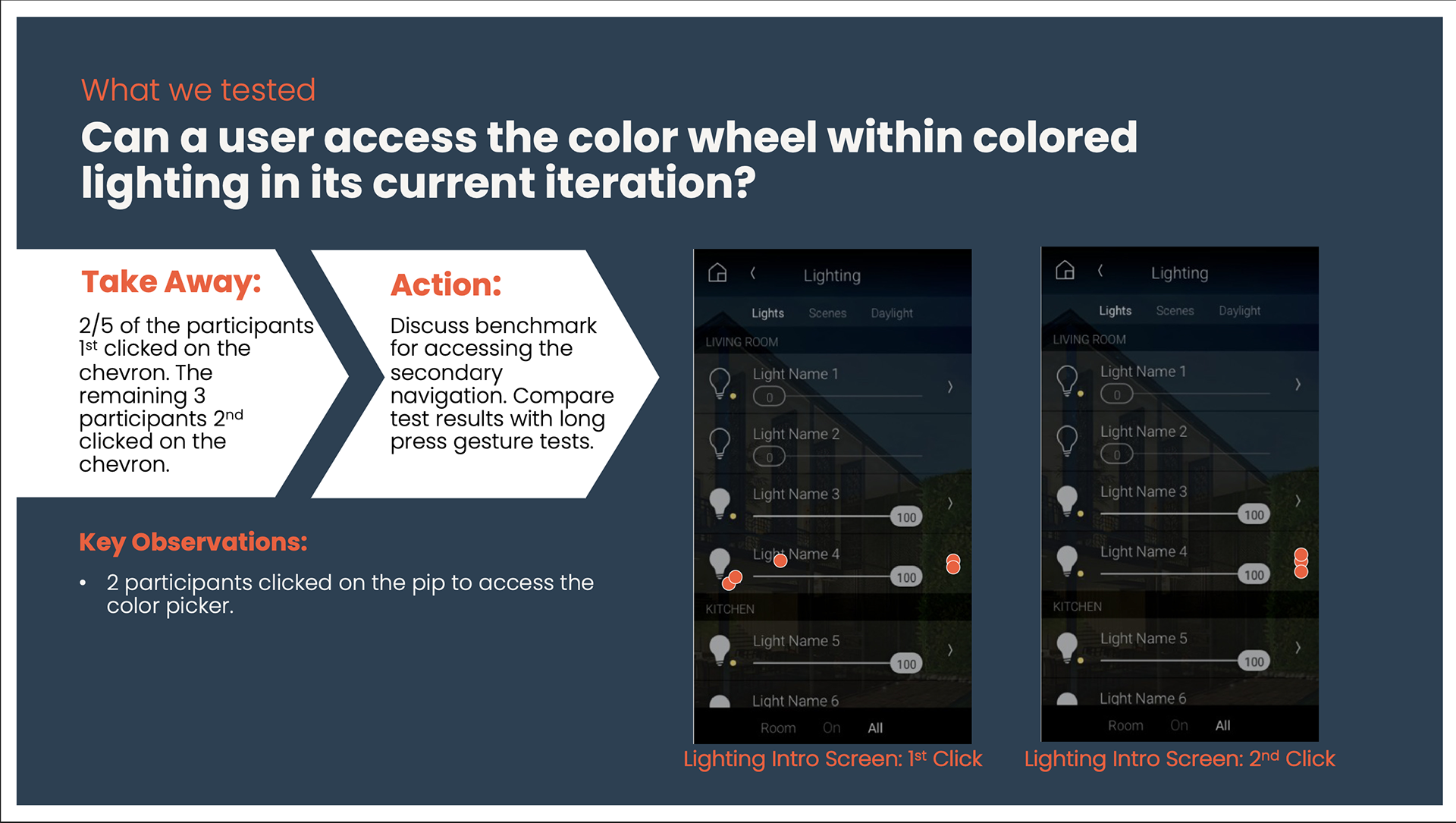
After discovering poor results with the long-press for editing color, UX, UX Research, and Product Management collaborated to do rapid layout user tests to refine the interaction pattern, resulting in a more discoverable interface using the > to edit and abandoning the legacy OS long press.
After discovering poor results with the long-press for editing color, UX, UX Research, and Product Management collaborated to do rapid layout user tests to refine the interaction pattern, resulting in a more discoverable interface using the > to edit and abandoning the legacy OS long press.
how - timeline and costs :
• User testing took 5 weeks under $300 for unmoderated user tests with the general population.
• Multiple rounds of user testing allowed many design iterations to discover and keep iterating until we improved the user experience.
• Multiple rounds of user testing allowed many design iterations to discover and keep iterating until we improved the user experience.
The Results - What We Learned:
• Established design systems and navigational patterns are often hard to change, and need validation with user testing before the investment can be made in engineering. As the product grew, the old design system was no longer intuitive and discoverable.
• Timing was key- we were able to iterate before a larger product launch.
Multiple rounds of user testing and design iteration led to a better user experience for end customers with better discoverability and usability, updated before the end of beta testing and release to our professional channel.
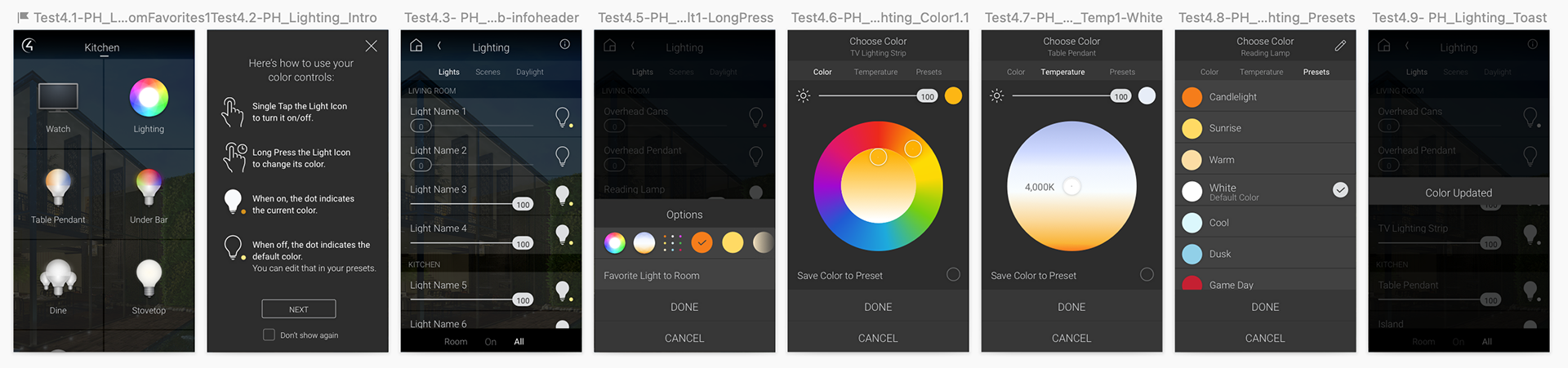
New Icon updates expanded the design system:
• Timing was key- we were able to iterate before a larger product launch.
Multiple rounds of user testing and design iteration led to a better user experience for end customers with better discoverability and usability, updated before the end of beta testing and release to our professional channel.
New Icon updates expanded the design system:
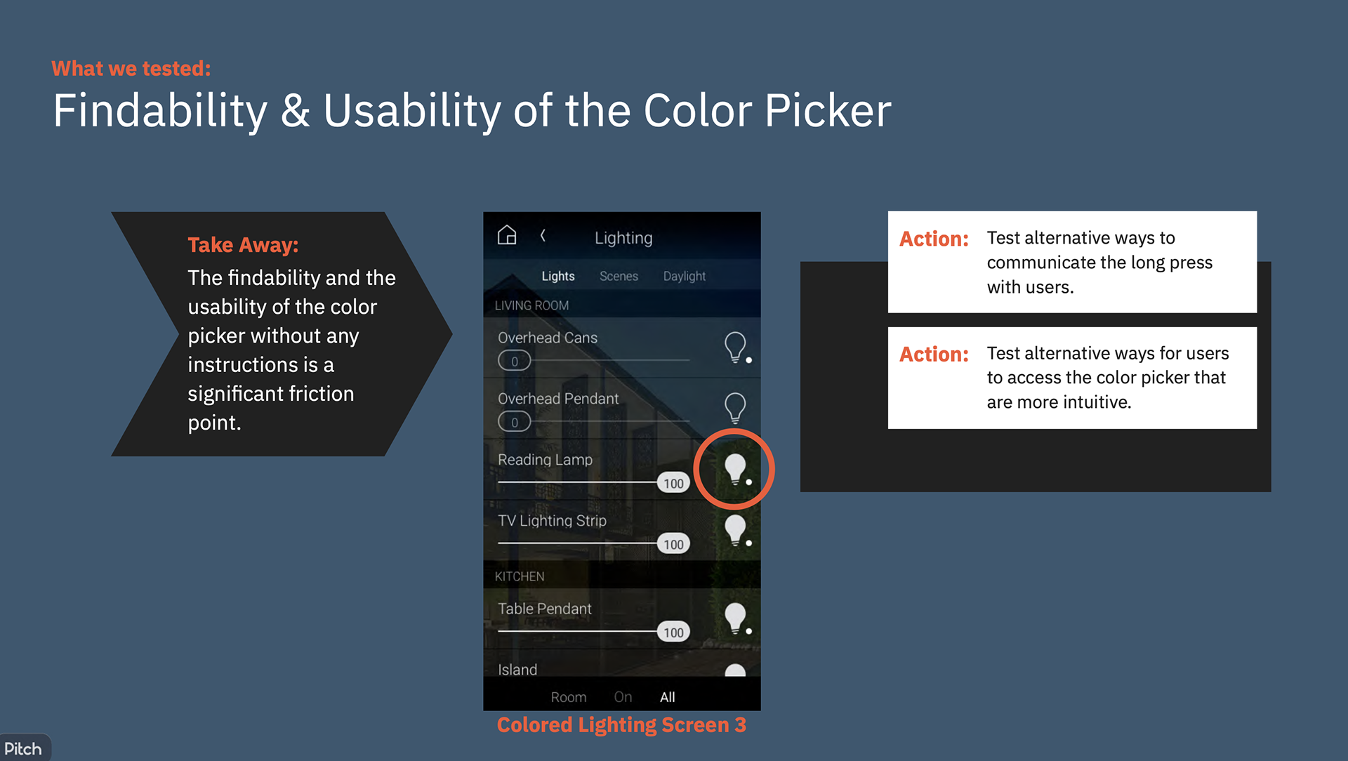
• Updated the edit icon - by changing the legacy long press to edit, to the chevron/arrow icon, edit was more discoverable and successful. This wasn't on the roadmap, this friction was discovered in rounds of user testing.
• To create colorized bulbs to show the color state was a collaboration with the mobile development team and driver developers. Not a small ask.
• Update to UI row component - by moving light bulb to the left, and using the chevron/arrow icon for primary edits, led to successful user discovery and task completion with no onboarding.
The end result -- Updated Design:
Success looked like: intuitive, discoverable, and tested well without onboarding
(It can take many iterations and collaborations to get to the obvious/easy/discoverable place)
(It can take many iterations and collaborations to get to the obvious/easy/discoverable place)
the messy and rapid Process of user testing and iteration:
Team Collaborators: User Testing Lead, Product Management, and Product Design (me)
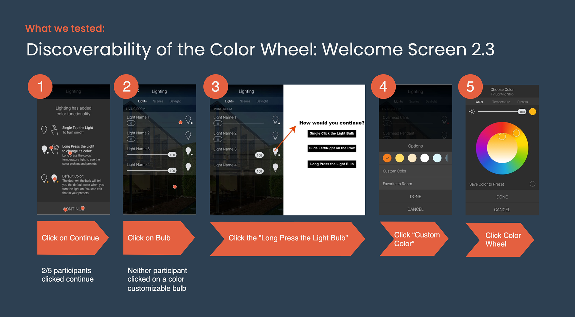
1- User Testing long press to edit color
Results: Confirmed poor discoverability or task completion.
Action: find a better way.
2- Test a new direction: Add Onboarding Screen Describing the Long-Press
Hypothesis: Will users be more successful in editing their lighting color if we teach them about this interaction?
• Tested for Task-Completion and Comprehension
• Tested Text Instructions vs. Showing images/gestures with text instructions
• Tested Text Instructions vs. Showing images/gestures with text instructions
Results: Onboarding did not improve discoverability.
Action: explore another approach
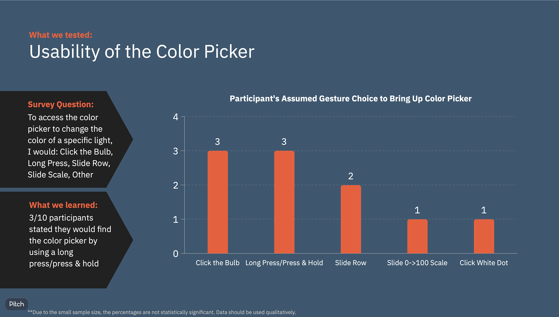
3- Design Pivot: Rapid User Testing introduces a New Design Pattern
Hypothesis: Use a new design pattern, ">" to edit color. (IOS design pattern)
Results: Successful discoverability and task success rate.
Action: Update "edit" design pattern in lighting, and throughout ecosystem for consistency and discoverability.